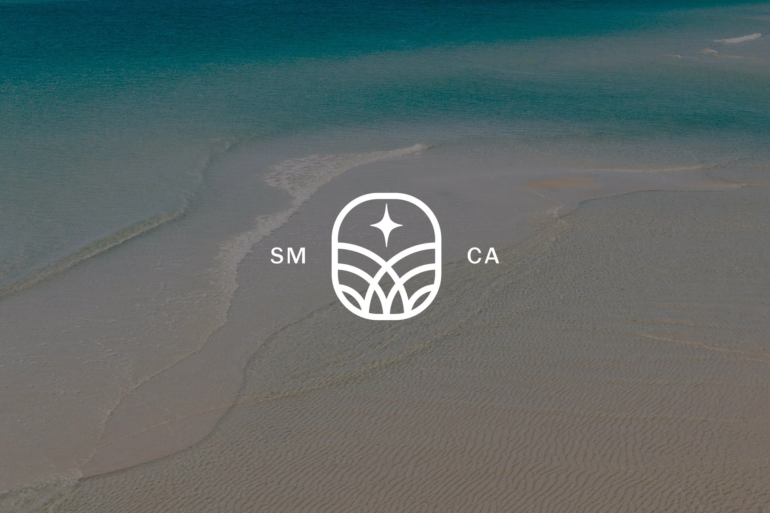
MAREN
A beach with sand and ocean waves, featuring a white icon in the center with the letters 'SM' on the left, 'CA' on the right, and a star above a stylized landscape design.
A branding style guide featuring the name 'Maren' in a script font. The guide includes typography examples of the same font in normal and italic styles, color palette with Harbor Blue, Crimson Tide, Salt Foam, Sea Mist, and Golden Drift, and an icon resembling a stylized oval shape with a star and wave-like patterns inside.

Overview

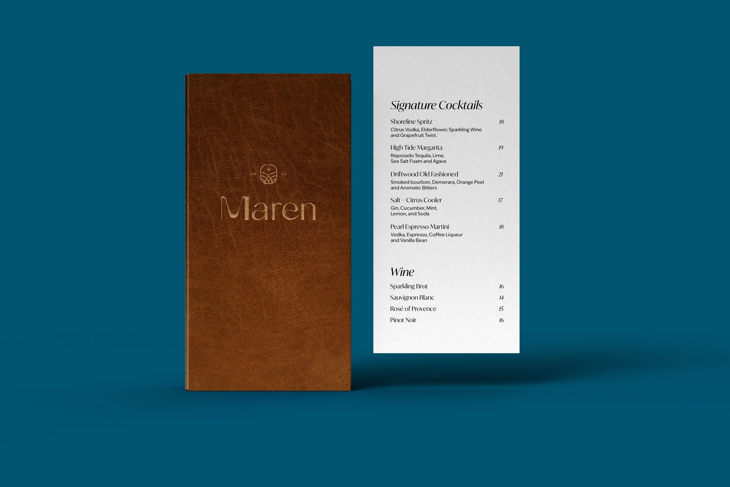
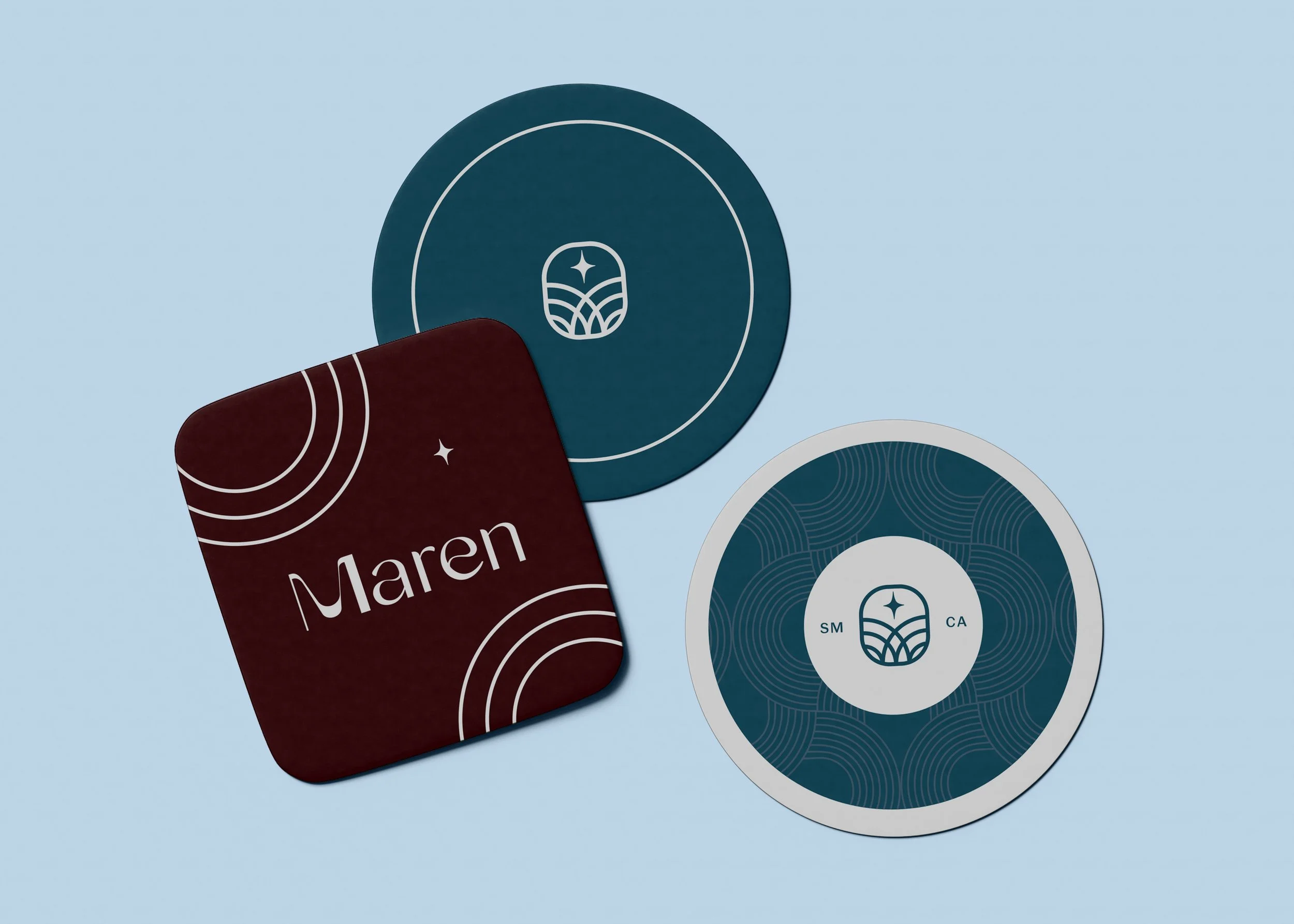
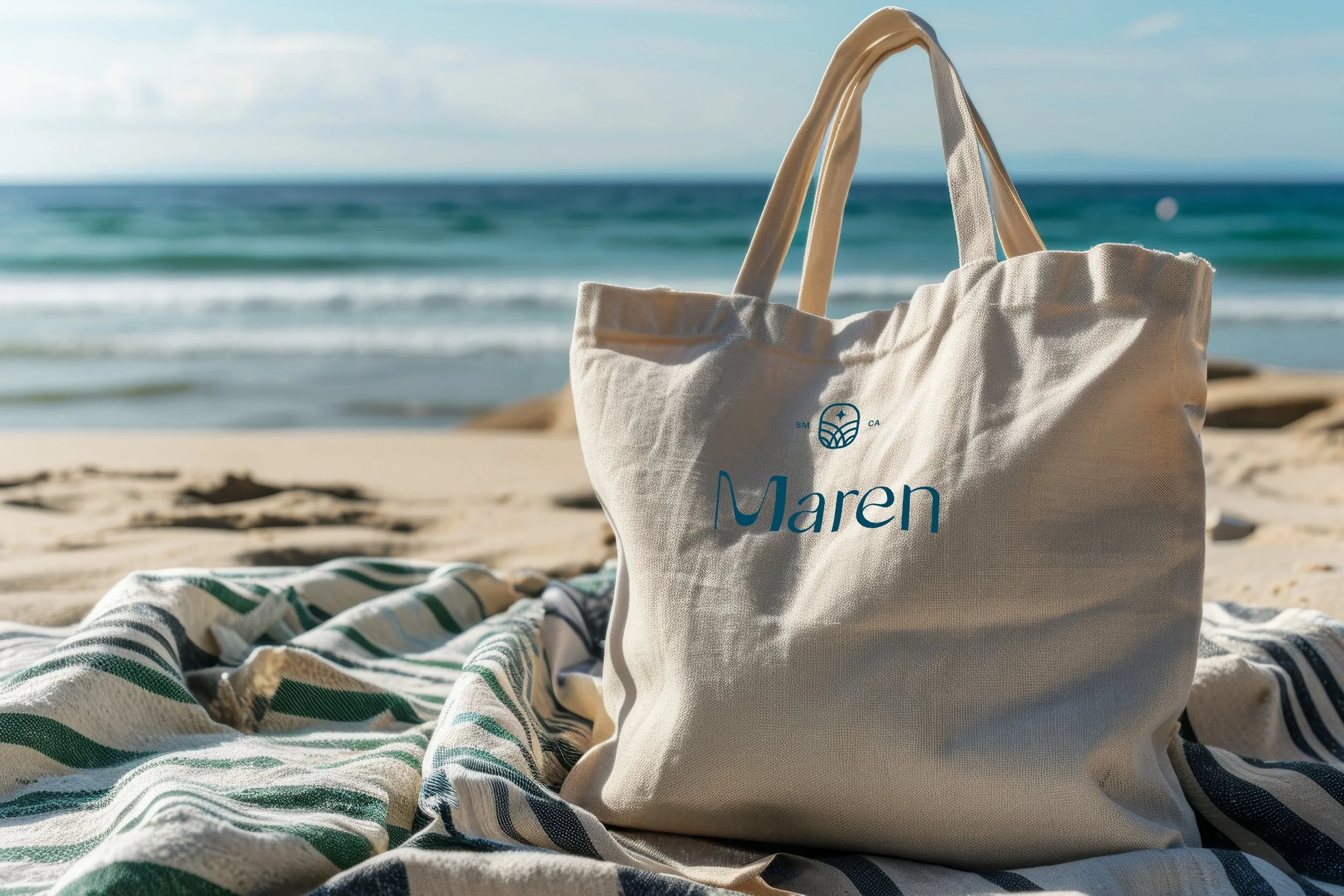
Maren is a coastal restaurant concept inspired by relaxed, refined living. While at Tenderling, I collaborated on developing one of the brand identity directions, focusing on a serene and timeless visual experience.

Challenge

Create a brand that felt calm, approachable, and sophisticated — capturing the light, textures, and warmth of coastal living in a simple, elevated way.

My Role

Supported concept development and helped shape the brand identity direction, including logo explorations, menu layouts, and brandapplications.

Outcome

A refined, understated visual identity that translated seamlessly across touchpoints, evoking the warmth and simplicity of coastal living.

Art Direction
Penny Moore and James Moore

Close-up of a white sea shell with the text ‘Salt in the air and the fare’ overlaid, next to a pattern of concentric circles on a dark red background.
A menu card and a brown leather folder with the text ‘Maren’ embossed on it, set against a blue background.
Three round coasters with blue and white designs, and a square dark red coaster with white text reading ‘Maren’ and white curved line patterns.
A bartender pouring a drink from a glass pitcher into a cocktail glass at a dimly lit bar.
A beige tote bag with the name "Maren" printed on it, sitting on a striped towel on the sandy beach. In the background, ocean waves and the blue sky are visible.

Tools
Illustrator, InDesign, Photoshop